Week 2
Tezuka
For this week I read Phoenix issue 1 Dawn.
Overall the whole manga was very whimsical, and I'm a total sucker for the nostalgic retro anime style that is both used in Astro Boy and Phonenix. It livens up the pages so much, and does give off an early mickey mouse vibe too. Another thing about the style is that I always thought limbs that widen towards the end was more of a contemporary choice of the 2000's to 2010's. But seeing it drawn out in Phoenix proves otherwise.
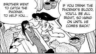
Nagi's proportions in this scene (girl looming over her sister) are awkward, but still cute nonetheless.
I as loved Nagi's spunk, she doesn't take any smack from anyone.
(Still talking about style here) I loved how Tezuka used crosshatching for texture and flow in panels as well. The use of crosshatching, dotted lines, negative space, it all really shows how he can make the environment dynamic against the simplistic blocky characters.


HAHA! Yes Her Spunk thats a good note, I felt that way too. I think its good they built up her personality to not be passive, its more of a good role model for girls who picked up Phoenix or for guys who were reading to know not to mess with them haa :)
ReplyDeleteI also like the style for this comic too. I remind me of the classic animations in the early 1920's where most characters had massive eyes and huge hands yet most of their stories are whimsical.
ReplyDelete